NSA Website Redesign
Redesigned the NSA’s website to improve accessibility and navigation, based around the national security needs of partners of the agency who work in private industry defense contractors.
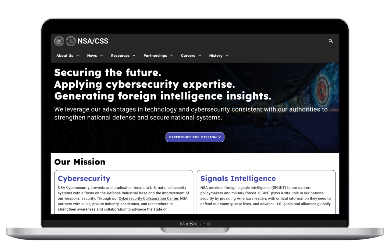
Click on the button below or the picture to try out the prototype!
Check it out!Overview
The NSA, National Security Agency, already has a confusing reputation as the surveillance wing of the US Department of Defense. For visitors of their website, it’s even more confusing.
This redesign study seeks to improve navigation, and correct accessibility issues from inadequate color contrast and shape, especially for private industry and defense contractors who rely on the NSA’s services to protect vital national security interests.
My Role
As a UX researcher and designer, my responsibility is to identify accessibility and navigation issues on the original NSA website, create a redesign, and test the redesign to ensure that it meets accessibility and navigation needs.
Scope of Project
The scope of this redesign is limited to redesigning the home page of the website and navigation elements within a 5-week period. Actually reaching out to national security professionals is out of the scope; therefore the design will be assumed to cater towards typical civilians.
Design Analysis
Contributors: Sunny Xu, Muskan K.
Intended Userbase
Who would use the NSA's website?
Since Muskan or I are unable to contact national security professionals, we created a fictional persona: Joe, an engineering director at a defense manufacturing firm, to represent civilian users
For Joe to fulfill his duties, he needs to stay up-to-date about national security protocols to protect his workplace and cooperate with other US defense organizations. As a director, he does not have much time to sit down to browse websites like the NSA’s, and he may even ask his subordinates to look at it instead, who may not be in the know.
Testing the NSA's Website
I partnered with fellow designer Muskan K. to collectively perform initial testing on the NSA’s original website with users.
Users were asked to complete these tasks on the desktop version of the website:
- Scroll through the home page
- Go to the “News and Highlights” section and read a news article
- Go to the “Cybersecurity Advisories” section and read a guidance document
Analysis
After reviewing the user test notes, 4 notable pain points were identified:
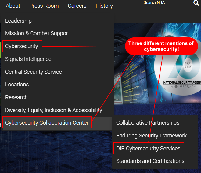
- Header Navigation Bar: Users were confused about similarly-named categories, especially the three different categories with the words "cybersecurity" in it.
- Finding News: Users were easily able to find news through the middle of the home page.
- Aesthetics: Users did not like the H1 font, likely due to how narrow the gaps are.


Navigation Analysis
Contributors: Sunny Xu, Muskan K.
Navigation Self-Test
Muskan and I tested the navigation on the desktop version of the website on our own to initially identify the functionality of the header. Some notable points were:
- Hovering over a primary category reveals a dropdown of secondary categories.
- The secondary category “Cybersecurity Collaboration Center” is the only secondary category with a tertiary category dropdown.
- Hovering over the categories is the only way to identify if the category has sub-categories.
- The primary category “Careers” has no dropdown.
Navigation Test Plan
To assess the usability of the navigation specifically, we tested additional users to complete the following tasks:
- Use the top nav bar to find news
- Use the top nav bar to find out collaboration or partnerships with the NSA
- Use the footer to find the NSA’s contact info
Analysis
Our testing with 4 users revealed additional issues with the navigation:
- Users may not have been able to distinguish between the navigation categories because of the verbosity.
- The hover reveal of the header navigation slowed navigation down due to mouse aiming issues.
- Some users did not notice the header navigation until later in the test session.
- Users were not aware of tertiary dropdowns, likely because of a lack of visual cues.
Ideation
Card Sorting

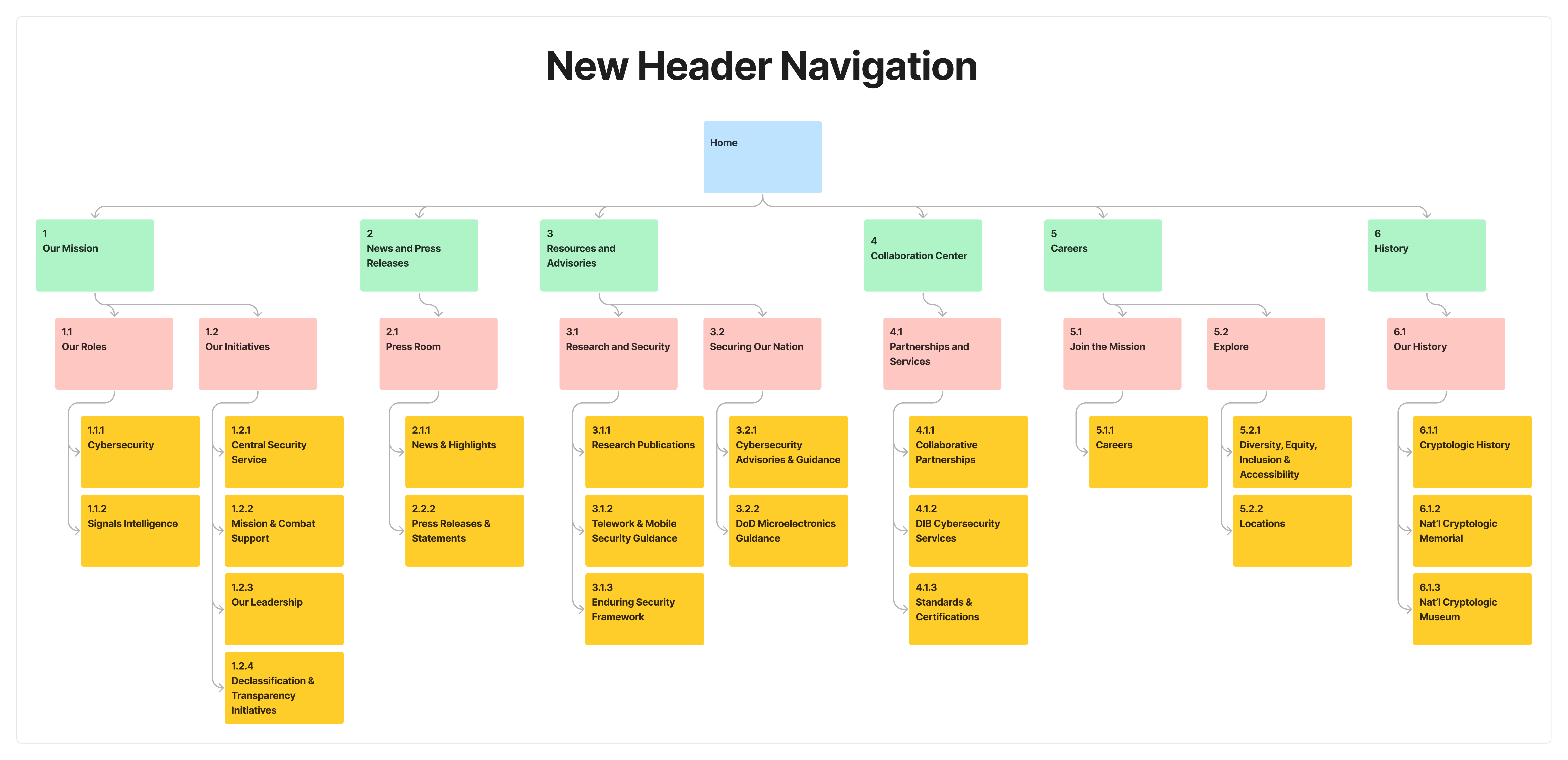
Primary categories (in green) were increased from 4 to 6 to allow users to glance to get an idea of where to go. Secondary categories (in yellow) were placed under category types (in red).
Low-Fidelity Prototype
Design Inspiration
I used an InVision board to organize various inspirations for the redesign of the NSA’s website. It contains 3 sections:
- Overall design choices, pulled from Dribble and various other US government websites
- UI patterns of balance and contrast
- Aesthetic design choices, with potential colors, fonts, and background images pulled directly from the NSA’s original website
Low-Fidelity Design Choices
As to not disturb users’ familiarity with the website, the homepage’s overall layout was retained. However, some design choices were changed:
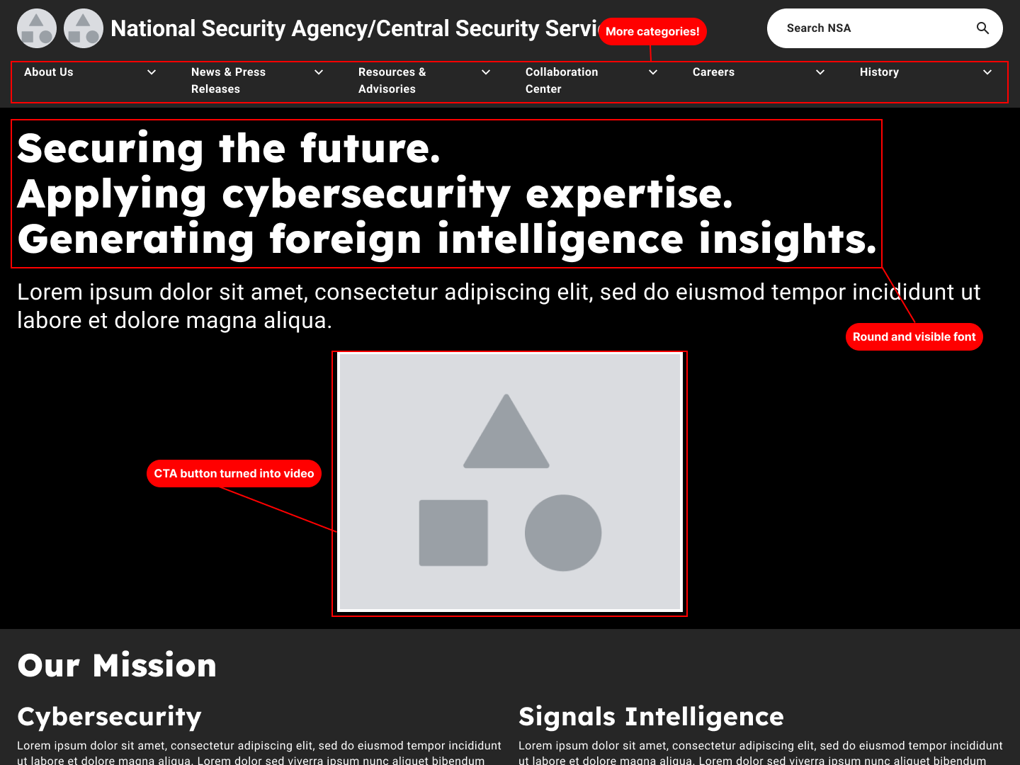
- The header navigation was changed to be under the logo instead of inline with the logo.
- The search bar was made round and solid white to ease the strain on the eyes.
- The navigation categories and the NSA’s slogans were kept for the introductory section/hero/jumbotron. Since users would not have time to glance at everything for 5 seconds, copy text was written using lorem ipsum generators.

5-Second Test
I used the test platform service UsabilityHub to assess users’ first impression of the homepage redesign, using an unsupervised test link. The following short questions were asked:
- What was the first thing you noticed?
- Who do you think this website is intended to serve?
- Write the name of one of the categories on the header that you can remember.
I shared this link in a Slack channel and received 7 responses. After analyzing the responses, here are some notable findings:
- Users typically noticed the top of the page and the hero text first.
- Users can tell this is a site for the NSA at first glance.
- Users recalled between 0 to 3 primary categories.
- Some users wanted the grey-black background to have more contrast, but others found the grey-black background fitting for the NSA’s nature.
Mid-Fidelity Prototype
Mid-Fidelity Design Choices
In response to the feedback from the 5-second test, the following changes were made:
- The 6 primary categories in the header were rearranged to be left-justified instead of center-equidistant, and the names were changed to be as short as possible for each.
- The mega-menus now include the name of the category and a section summary to the left, and the subcategories to the right.
- Background images and actual copy text from the NSA’s website were added to the rest of the homepage.
- The background color was changed from alternating grey-black to alternating dark background-white.

Prototype Navigation
I tested the mid-fi prototype with 3 additional users, using the same navigation tests as in Phase 2.
- Users generally found the choice of font and colors to be easy to read.
- Users found news quickly through the header or news highlights in the body.
- Users found it difficult to locate “collaboration” but found it by going through each header category.
- Users expected contact info to be either with "Careers" or "About Us".
Post-Test Changes
The following changes were made:
- Secondary category font size was increased from 12px to 14px for better visibility.
- The video was replaced with an expanding call-to-action (CTA) button.
- “Contact Us” was added under the “About Us” and “Careers” categories.
Future Opportunities
Before the high-fidelity prototype and actual website can be made, the following changes should be made to the mid-fidelity prototype:
- A/B testing should be conducted on the hero section to see whether users prefer to see the NSA’s introduction video straight away or view it by clicking the CTA button.
- The “News” and “Partnerships” pages should be prototyped to redesign and test those parts of the original website.
- A mobile prototype should be developed for mobile users.
Overall, this website redesign study proved to be an excellent experience to learn how users navigate websites that they're unfamiliar with, and design webpage components to make navigation smoother and easier.
Click on the button or the image below to be taken to the prototype.
Check it out!